TiDB, an open-source, distributed SQL database, provides detailed monitoring metrics through Prometheus and Grafana. These metrics are often the key to troubleshooting performance problems in the cluster.
However, for novice TiDB users, understanding hundreds of monitoring metrics can be overwhelming. You may wonder:
- How do these hundreds of metrics relate to each other?
- How can I quickly find which operations are the slowest?
- When I discover a slow write, how can I locate the cause?
TiDB 4.0.7 introduces a new feature in its web UI TiDB Dashboard: the metrics relation graph. It provides a tree diagram of the TiDB cluster performance metrics, enabling users to quickly see the relationships between TiDB internal processes and to get a new perspective on the cluster status.
Overview
The metrics relation graph presents database metrics as parent-child relationships. In the graph, each box represents a monitoring item, and it includes:
- The name of the item
- The total duration of the item
- The percentage the item duration takes up in the whole query duration
In each parent box, the total duration = its own duration + its child box’s duration. Take the following box as an example:

The tidb_execute item’s total duration is 19,306.46 s, accounting for 89.40% of the total query duration. Of this duration, the tidb_execute item itself only consumes 9,070.18 s, and its child items consume the rest.
If you hover the cursor over this box, you can see the detailed information about this monitoring item: its description, total count, average time, average P99 (99th percentile) duration, and so on.

The size and color of each box is proportional to the percentage of the item’s duration in the total query duration. Therefore, the items that take up too much time clearly stand out in the diagram. You can easily focus on these items and follow the parent-child link to locate the root cause of the problem.
Example 1 – investigating slow cluster response time
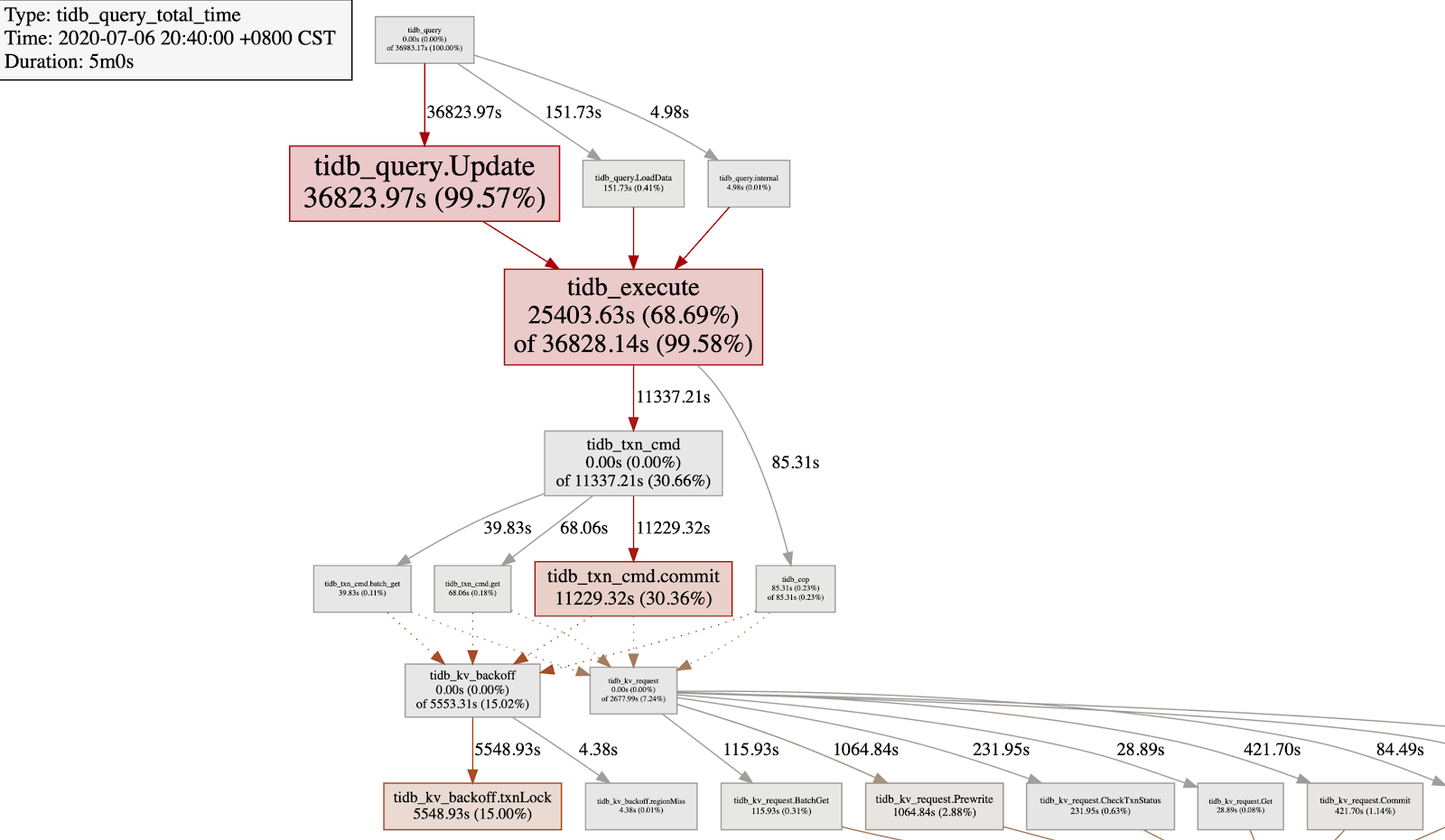
Assume that your company just launched a new application. You notice that the cluster response gets much slower, even though the server CPU load is quite low. To find out the cause, you generate a metrics relation graph:

From the metrics relation graph, you get the following findings in a glance:
| Box | Description |
tidb_query.Update | The UPDATE statement takes up 99.59% of the total query duration. |
tidb_execute | The TiDB execution engine takes up 68.69% of the total duration. |
tidb_txn_cmd.commit | Committing the transaction takes up 30.66% of the total duration. |
tidb_kv_backoff.txnLock | When the transaction encounters lock conflict, the backoff operation takes up 15%, which is much higher than the tidb_kv_request that sends Prewrite and Commit RPC requests. |
By now, you can say for sure that the UPDATE statement has a severe write conflict. The next step is to find out which table and SQL statement causes the conflict, and then work with the application developers to avoid the write conflict.
Example 2 – finding out why data import is slow
Assume that you need to load a large batch of data into your TiDB cluster, but the import rate is slow. You want to know why, so again you generate a metrics relation graph:

Note the shaded box near the bottom of the tree: ‘tikv_raftstore_propose_wait’. This box indicates that the “propose” process of TiKV’s Raftstore has a long wait duration. This usually means that Raftstore has hit a bottleneck. Next, you can check the metrics of Raftstore CPU and the latency of the append log and apply log. If Raftstore’s thread CPU utilization is low, then the root cause may be in the disk. For more troubleshooting information, you can refer to TiKV Performance Map or Troubleshoot High Disk I/O Usage in TiDB. You may also check whether there’s a hotspot in the cluster.
Try it out
To generate a metrics relation graph, you need to deploy TiDB 4.0.7 (or later) and Prometheus, an open-source monitoring system. We recommend you deploy TiDB using TiUP, which automatically deploys Prometheus along with the cluster.
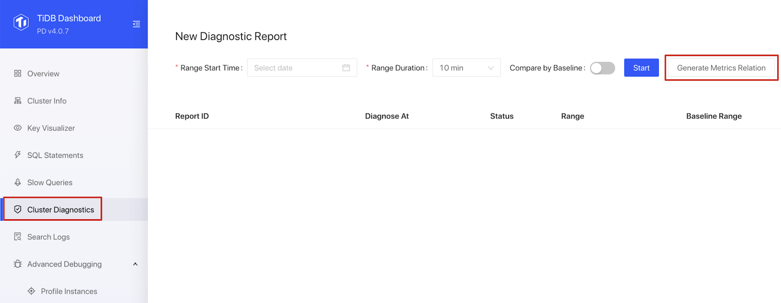
Once you’ve deployed TiDB, you can login to TiDB Dashboard to view the overall status of the cluster. In the Cluster Diagnostics page, configure the range start time and range duration, and click Generate Metrics Relation. Your metrics relation graph is ready!

Our next step
The metrics relation graph is aimed to help users quickly grasp the relationship between TiDB cluster load and numerous monitoring items.
In the future, we plan to integrate this feature with the TiDB Performance Map so that it can show the relationships between other associated monitoring items and even with their configurations. With this powerful feature, DBAs will be able to diagnose TiDB clusters with less effort and more efficiency.
If you’re interested in the metics relation graph, feel free to visit our repository to contribute to the code or raise your question.
Experience modern data infrastructure firsthand.
TiDB Cloud Dedicated
A fully-managed cloud DBaaS for predictable workloads
TiDB Cloud Starter
A fully-managed cloud DBaaS for auto-scaling workloads


