Author: Ruoxi Sun (TiDB Compute Tech Lead)
A database stores and loads data. That’s essential for businesses, but it sounds kind of boring, doesn’t it? But a database can do more and be more fun. Have you ever thought of using a database to make a piece of art? You heard me right—making artwork with a database. And you’ll never know how fabulous it can be until you try.
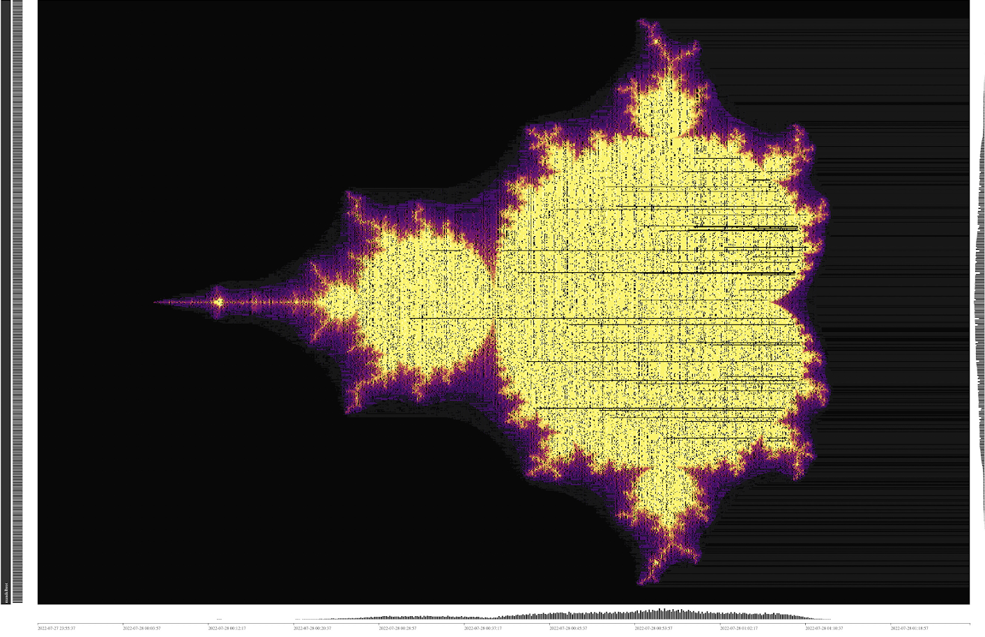
I’ve created a digital “painting” with TiDB, an open source, distributed Hybrid Transactional and Analytical Processing (HTAP) database. Take a look at it below. If you’re familiar with fractals, you might recognize that this is a Mandelbrot set. It looks pretty cool, doesn’t it?

A Mandelbrot set
I’m not the only one who creates art with TiDB. Many developers and users in the TiDB community have shared their works with us. Let’s take a stroll through the TiDB art gallery.

Wind by @fanruinet

Tornado by @HHHHHHULK

Northern Lights by @forever
Some of these digital paintings are created specifically as art, while others come from transforming real database workloads. They all look so cool.
I’ll show you how you can create your own art with TiDB. But first, you’ll need some background information.
A quick tour of TiDB
TiDB is an open-source, distributed, and MySQL-compatible HTAP database with strong consistency and high scalability. The TiDB Dashboard makes it easy to monitor, manage, and diagnose TiDB Clusters. It is a built-in component and does not require an independent deployment. The dashboard has also been open-sourced on GitHub.

TiDB Dashboard
The TiDB Dashboard includes a Key Visualizer page, which lets you analyze TiDB workloads and troubleshoot traffic hotspots. It also visualizes TiDB traffic in the form of a heat map in real time. The brighter the heatmap, the higher the traffic. Some of these heatmaps form incredible lines, colors, and shapes, making natural artworks.
The Key Visualizer will be the canvas on which you create your paintings.

TiDB traffic heat map with sequential reads or writes
Create and refine your painting
The heat maps from transforming real workloads can be striking, but such artwork is quite arbitrary. How can you create a digital painting based on your own imagination? Let’s take another one of my paintings, the Elden Ring, as an example.

Elden Ring, but database!
Map the coordinates
First of all, we have to map the drawing with coordinates (x, y) on the Key Visualizer. The horizontal axis represents time. However, the time intervals are not equally distributed. For the time in the current hour, the unit time interval can be one minute; and for the time in past periods, it can be hours or even longer. This is called a non-linear effect.
Assume that the resolution of your painting is X*Y pixels. Because paintings are rendered from left to right in Key Visualizer, we need to draw one vertical line with Y pixels during every time interval on the horizontal axis. Then, after X time intervals pass, the whole drawing will be fully rendered. However, because it takes one minute to render one vertical line with Y pixels, rendering the whole painting would take too long. Besides, the non-linear effect would make the left side of your painting too narrow, making the final painting look weird. That’s not fun!
To solve this problem, when I created the Elden Ring, I tweaked the TiDB Dashboard source code. I changed the horizontal axis to be fully linear and set the unit time as a fixed time interval of 5 seconds. Now, the drawing renders more quickly, and it won’t look weird and have a strange ratio.
The vertical axis represents the region that stores data, and one unit on the vertical axis represents one region. To draw the Elden Ring, I used Y regions, which equals the number of vertical pixels in the painting. Each region maps to a Y coordinate on the painting. However, if a TiDB region stores too much data (or too little), it is split (or merged). This means there would be more or fewer units on the vertical axis, which impacts the rendering process. To avoid this, we have to make sure that the units on the vertical axis are a fixed number, and that they equal the number of vertical pixels of your painting.
Fortunately, TiDB guarantees that each table it stores includes at least one region, and that any single region is not shared by two different tables. So, if we keep the amount of data in a table as small as possible, regions won’t be split. Since we can handle tables through a SQL interface, we can handle regions as well, though indirectly.
The following SQL statement creates Y tables and prepares the regions before the rendering process.
CREATE TABLE t_[y](id INT PRIMARY KEY);
Prepared regions by creating tables
As shown on the Key Visualizer above from table t_0 to t_Y, each table has its own region. Given the Y coordinate of the drawing is from the top down, we can map the pixel at (*, y) to table t_[Y - 1 - y].
Render the colors
After we map the coordinates, we need to render the pixels to a specific color. As I mentioned earlier, the color of the heat map represents the traffic of your workloads. The brighter the color, the higher the write or read traffic. Does that mean that we have to create heavy workloads to get a brightly-colored heat map painting? Not really. Key Visualizer allows us to adjust the brightness of the heat map color so we can create small workloads and then adjust the color brightness of the generated heat map. This way, you can keep the amount of your data small, and don’t have to worry about the region splitting. Also, small workloads will not overwhelm your database and impact your regular business.
Given that the color of the gray scale picture ranges from 0 (black) to 255 (white), we limit our workload to a maximum of 256 rows. Before we render the drawing, we insert the value 0 ~ 255 in each table:
INSERT INTO t_* VALUES (0), (1), ... (255);During the rendering process, for a given pixel (x, y) with color c, we make the following query at time 5 * x second:
SELECT * FROM t_[Y - 1 - y] where id < c;Each table only has one field, the column id. That small payload is enough for our task. The column id data type is integer so that we can easily tune the size of the workload by using a range predicate, that is, where id < c. id is the primary key, which corresponds to the key in the underlying Key-Value store. (In this case, we’re using TiKV, TiDB’s row storage engine.) The range predicate is then transformed to the key range scanned in the KV store, which is also the actual amount of traffic in regions. Therefore, the query above causes exactly c traffic within the range of 0 ~ 255 to be stored in this specific region.
Create your final painting
Now, you know how to map the coordinates and render the colors, then, we can use a little program called KeyvizBaker to automate the whole rendering process. It reads a PNG file, transforms it into grayscale, and makes Y queries every 5 seconds, repeating X rounds. The rendering process is like a printer printing a photo horizontally.
After you’ve set up everything, you can take a break and have a cup of coffee. Be patient and let the “Tarnished” work. After about X*5 seconds, you’ll get the Elden Ring mended. Bear witness!
Try it yourself
You’ve now learned how to create art with TiDB. Do you want to give it a try? Feel free to download and deploy TiDB to your own environment. If you have any questions, contact us through Twitter or our Slack channel. And if you like the painting you create, feel free to share your work on Twitter and mention @PingCAP. We’d love to see!
Keep reading:
- Simplify Database Geo-redundancy Backup with Cloud Storage Services
- Announcing TiDB 6.2 with Better Observability, Faster Execution, Enhanced Disaster Recovery, and More
- Building a Web Application with Spring Boot and TiDB
Editors: Fendy Feng, Tom Dewan, Rick Golba
Experience modern data infrastructure firsthand.
TiDB Cloud Dedicated
A fully-managed cloud DBaaS for predictable workloads
TiDB Cloud Serverless
A fully-managed cloud DBaaS for auto-scaling workloads


